Web designer and developer
Shifted the mobile team to a design-led mindset, restoring user trust in sync and helping save the app from deprecation.
Improving Sync Confidence in the Artlogic App

Summary
Led a design-driven rethink of the Artlogic App’s sync experience, shifting the mobile team from engineering-led iteration to a user-centred design process. By aligning stakeholders around a clear product purpose, facilitating collaborative discovery, and improving UX transparency, we rebuilt user trust, reduced support load, and preserved the app’s role as a key sales tool.
Role and timeline
- Role: Product Designer
- Team: 2 iOS engineers, 1 platform engineer, 1 PM
- Timeline: ~4 months (2024)
- Platform: Native iOS app
The challenge: trust in sync was eroding the app's value
Artlogic’s wider platform is an enterprise SaaS solution for galleries, supporting everything from inventory and sales to client CRM and marketing. The mobile app is a companion product focused specifically on sales, and most importantly, Private Views - curated collections used in client conversations, gallery spaces, and at high-stakes events like art fairs.
The app is designed to be offline-first because galleries often present in locations with poor connectivity. But trust in its sync mechanism had degraded badly, especially during the rushed migration to Swift (version two of the app), which was released without proper UX oversight.
Internally, there was confusion about the app’s purpose. While the support and client liaison teams were overwhelmed with syncing complaints, other departments weren’t sure what the app was for. Despite this, the app was a major sales tool and a core reason some galleries chose Artlogic over competitors.
When I joined the mobile team, the app was at risk. My Director of UX was acting as interim PM, and we were tasked with deciding whether it was still worth investing in. We conducted a series of stakeholder interviews to get aligned on the app’s purpose, and user interviews to understand pain points. One thing became clear: the syncing experience was the biggest blocker to adoption, satisfaction, and retention.
This wasn’t just a UX problem, it was undermining the business value of the app itself.
My approach: design-led alignment and focused UX improvements
This was the first time the mobile team had worked with a dedicated designer. I helped shift the team’s mindset from engineering-led iteration to a design-led, user-informed approach.
Discovery
We began by mapping the landscape: interviews with engineering, sales, marketing, and support revealed how misunderstood (and mission-critical) the app really was.
From users:
- Galleries saw it as a sales tool first and foremost.
- Many felt forced to prepare it in advance due to lack of trust in real-time syncing.
- A key quote from one client: “Despite having 8 users on the Artlogic app, we still use a competitor app for fairs—syncing is too unreliable.”
We translated our findings into a working hypothesis:
“We believe we’ll increase user confidence in the sync process if users are presented with clear, transparent information about update progress and history. We’ll know we’re successful when sync-related support tickets drop and qualitative feedback improves.”
This was pressure-tested with client feedback and stakeholder buy-in, and ultimately helped secure leadership’s support to continue investment in the app.
- Analysed support tickets and complaints with the PM.
- Conducted interviews with users from key galleries.
- Facilitated a technical workshop to map the sync flow and define frontend opportunities.
- Identified critical constraints: sync speed and structure were limited by legacy backend architecture.
Key insights
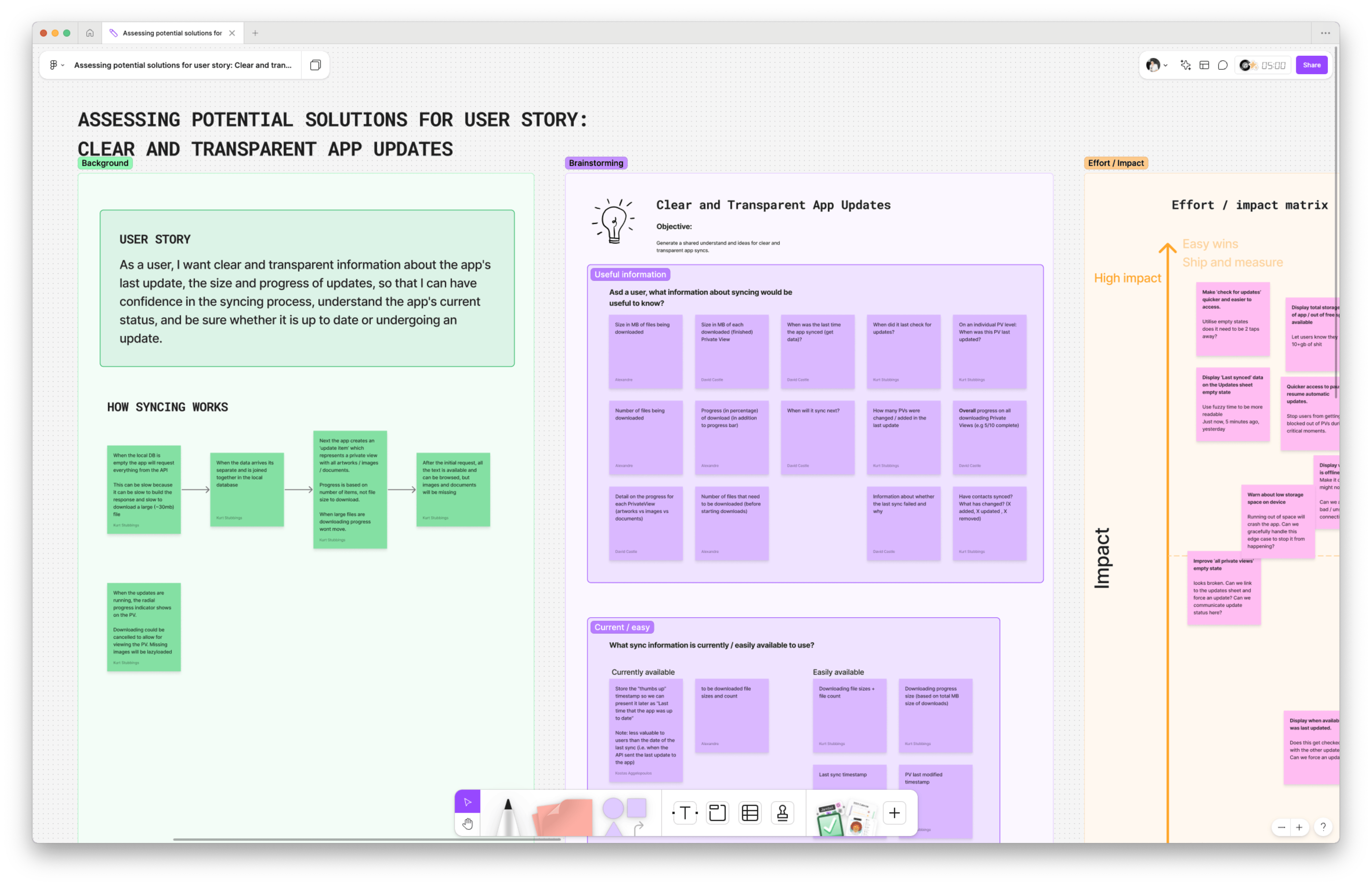
From a FigJam workshop with the full mobile team, we mapped the current sync flow and ran structured brainstorming sessions using prompts like:
- What sync information would be useful to users?
- What can we access via the API?
- What are known limitations?
We plotted our ideas on an impact–effort matrix and identified quick wins (like reworking the update sheet) and higher-effort bets (like download prioritisation). The engineers helped clarify constraints like the inability to predict total download size, but we found a workaround: we could surface cumulative data downloaded in real time instead.
- Users didn’t know when sync was happening or if it had finished.
- Completed downloads disappeared too quickly, creating a sense of instability and chaos.
- Large files appeared to "freeze" because progress only updated after completion
The solution: design for clarity, and perceived performance
We couldn’t make sync faster. But we could make it feel transparent, understandable, and responsive. We couldn’t make sync faster. But we could make it feel transparent, understandable, and trustworthy.
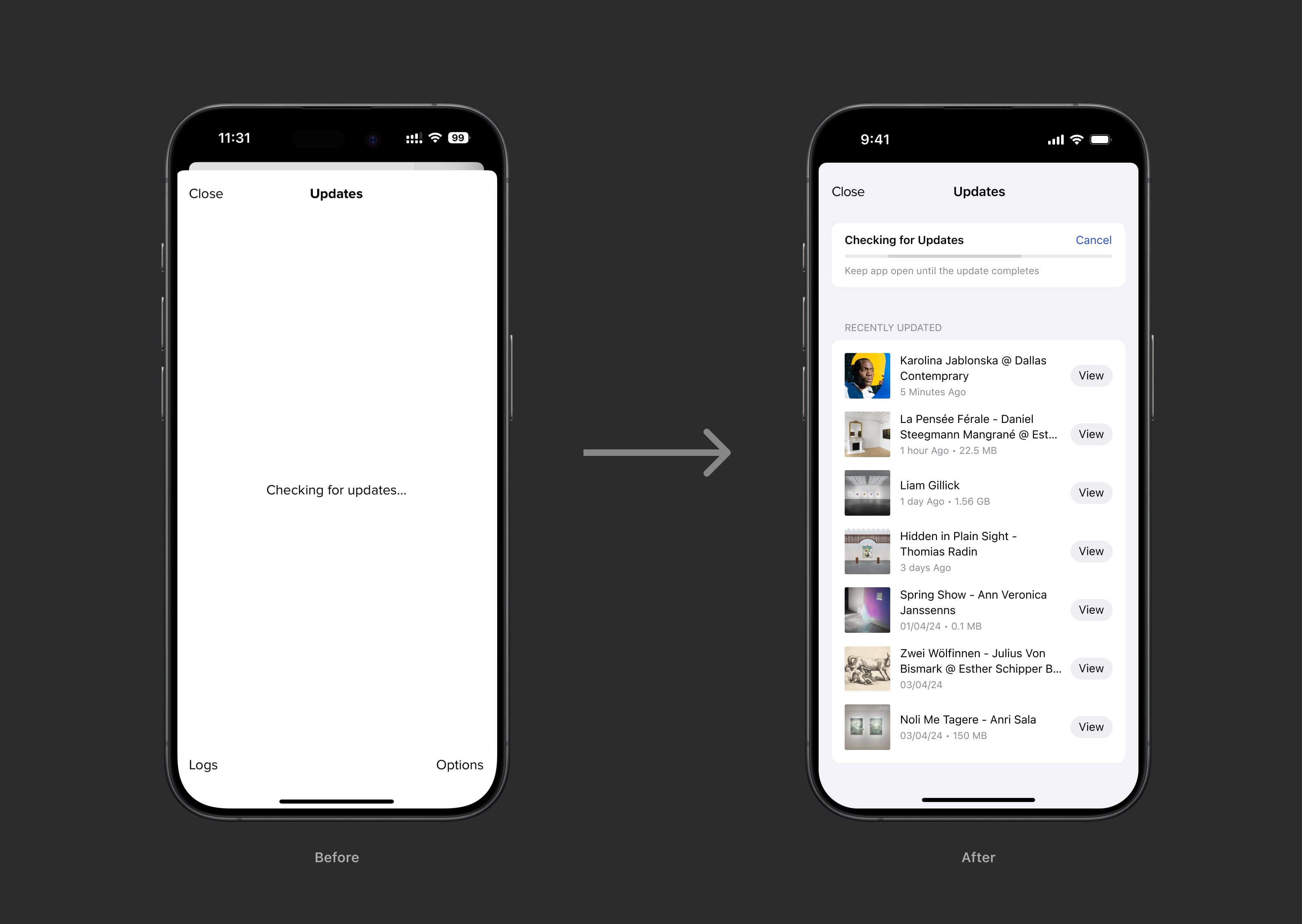
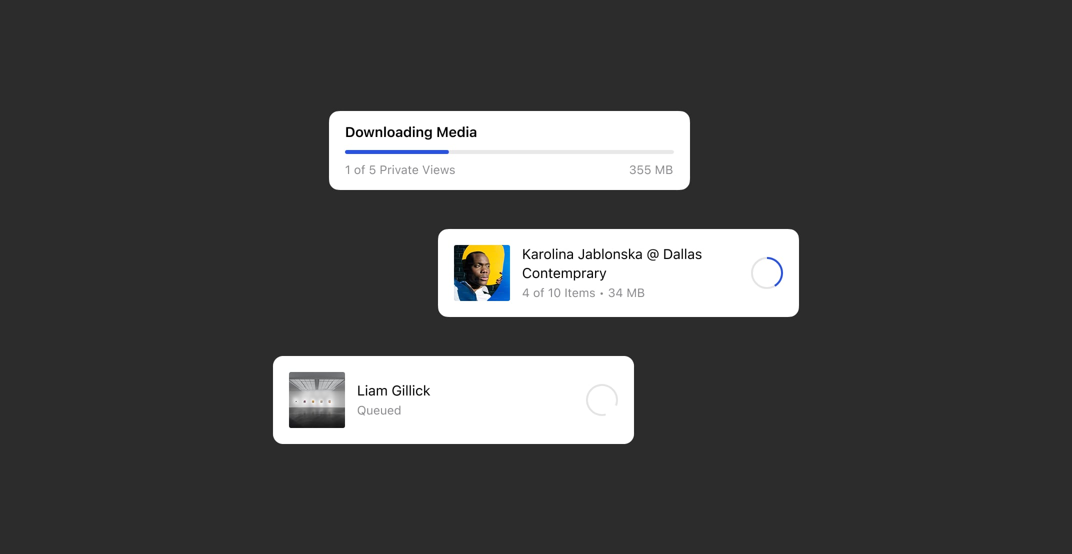
1. Reworked the Updates sheet for clarity
- Added persistent status at the top: "3 of 7 Private Views synced".
- Let completed downloads remain visible briefly for better continuity.
- Designed the sheet to reduce visual jumpiness and improve scan-ability.
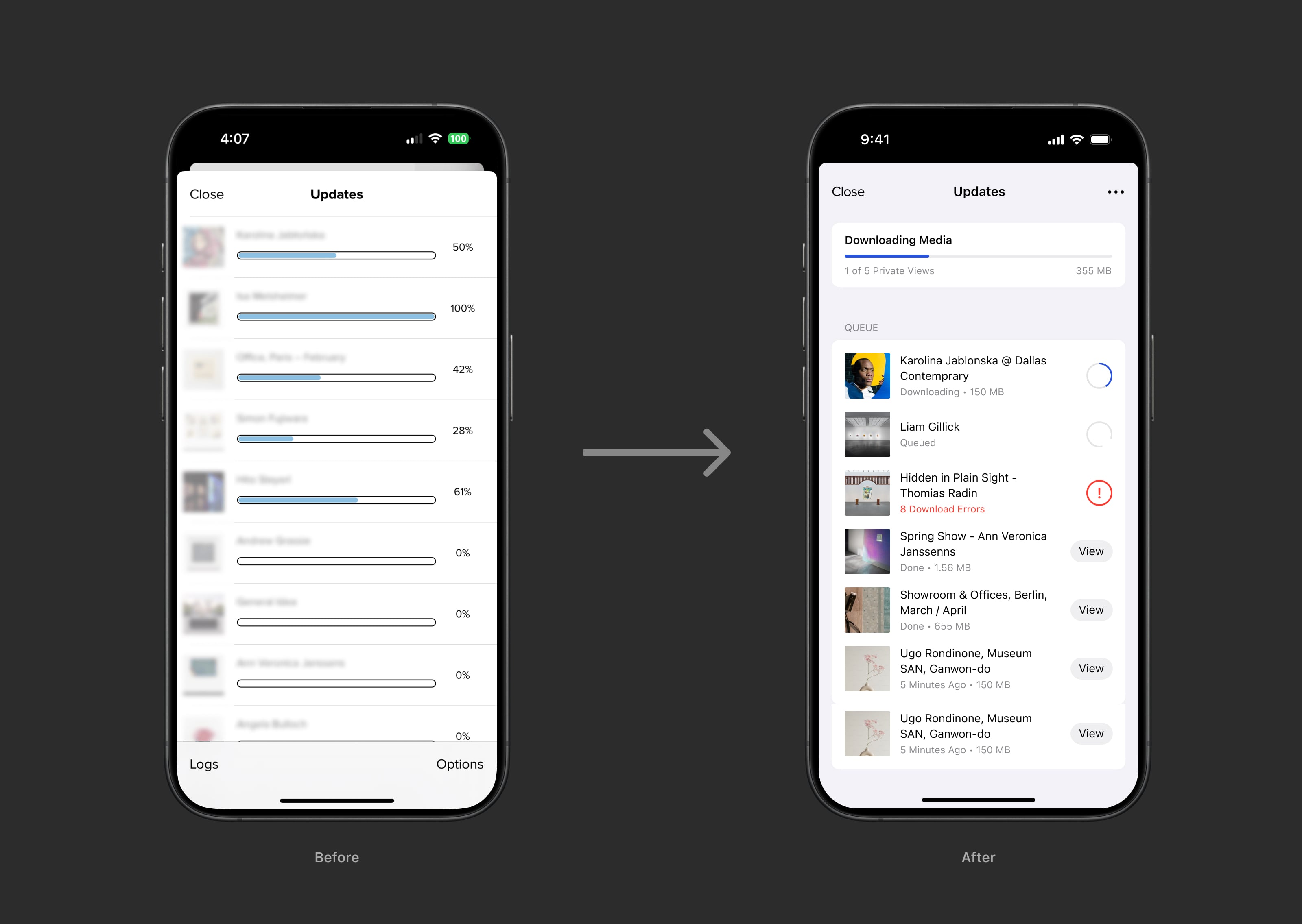
2. Introduced a cumulative download indicator
- Displayed overall file progress (e.g. "12 MB of 65 MB downloaded").
- Reassured users that sync was in progress, even when individual files were large.
- Helped reframe performance from "it's stuck" to "it's working through it".
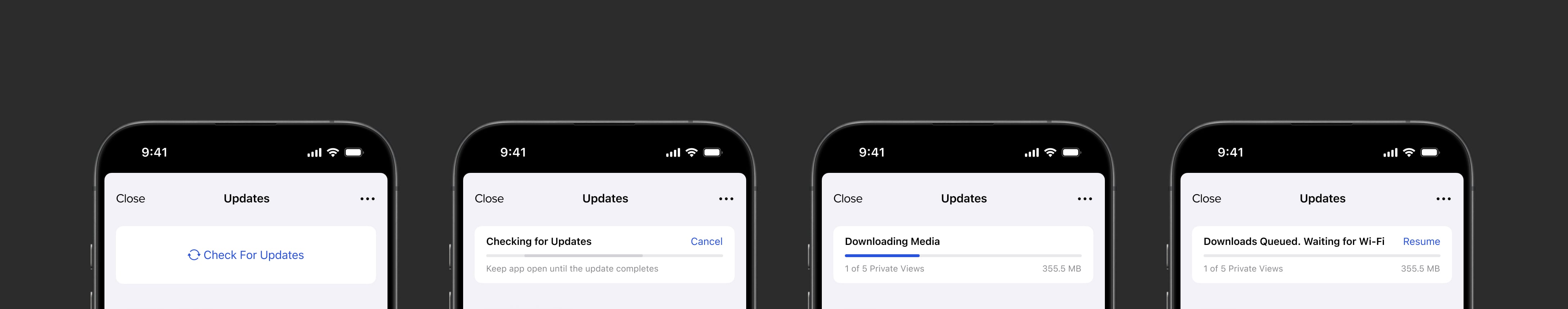
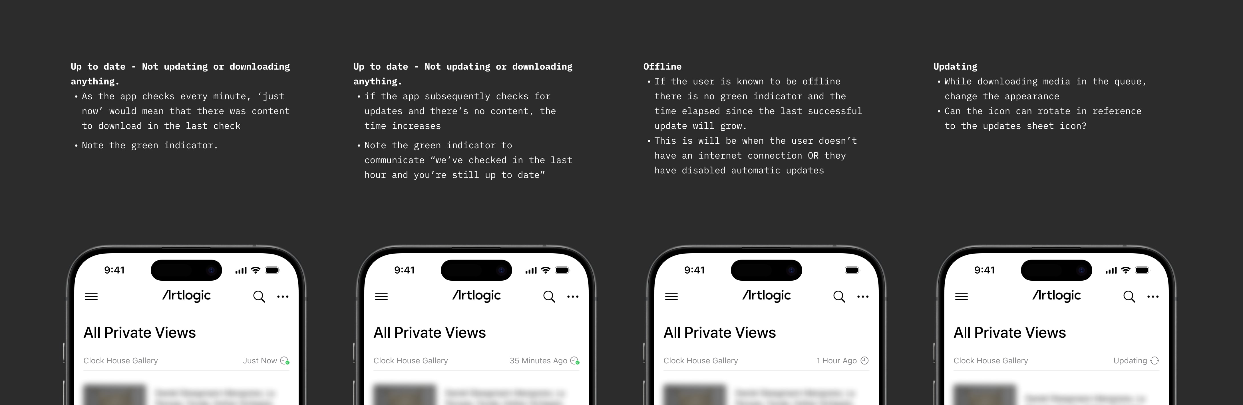
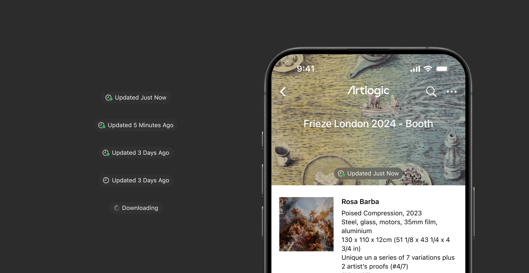
3. Added sync indicators at global and local levels
- Introduced a persistent sync status in the app header: Syncing / Up to date / Error.
- Each Private View gained a timestamp and icon to reflect sync state without disrupting the minimalist, client-facing design.
- This required careful stakeholder negotiation: some team members worried about visible UI disrupting the aesthetic during client presentations. We addressed this by keeping indicators subtle and out of the main content path, while still visible at a glance.
- A new sync status in the app header gave users instant context: Syncing / Up to date / Sync failed.
- Each Private View had its own icon and timestamp: downloaded, in progress, error, outdated.
- These surfaced critical information without requiring users to hunt, meeting them where they already were.
4. Unblocked access with progressive loading
- Previously, users were locked out of Private Views during sync, often causing frustration.
- I proposed unblocking access immediately after metadata was synced, so users could begin browsing structure while media downloaded in the background.
- This surfaced a new issue: missing images on first load, leading to the next improvement.
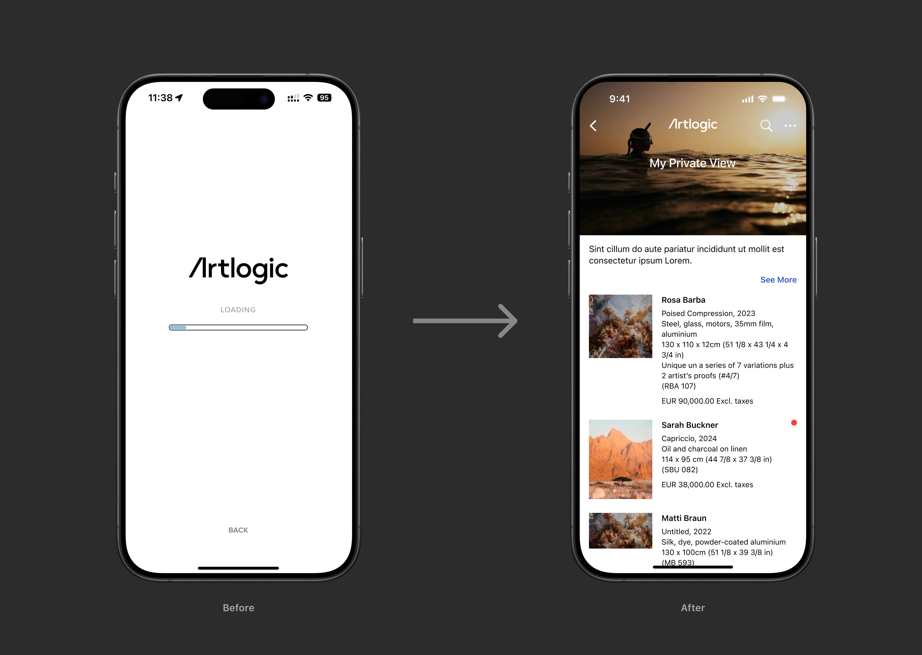
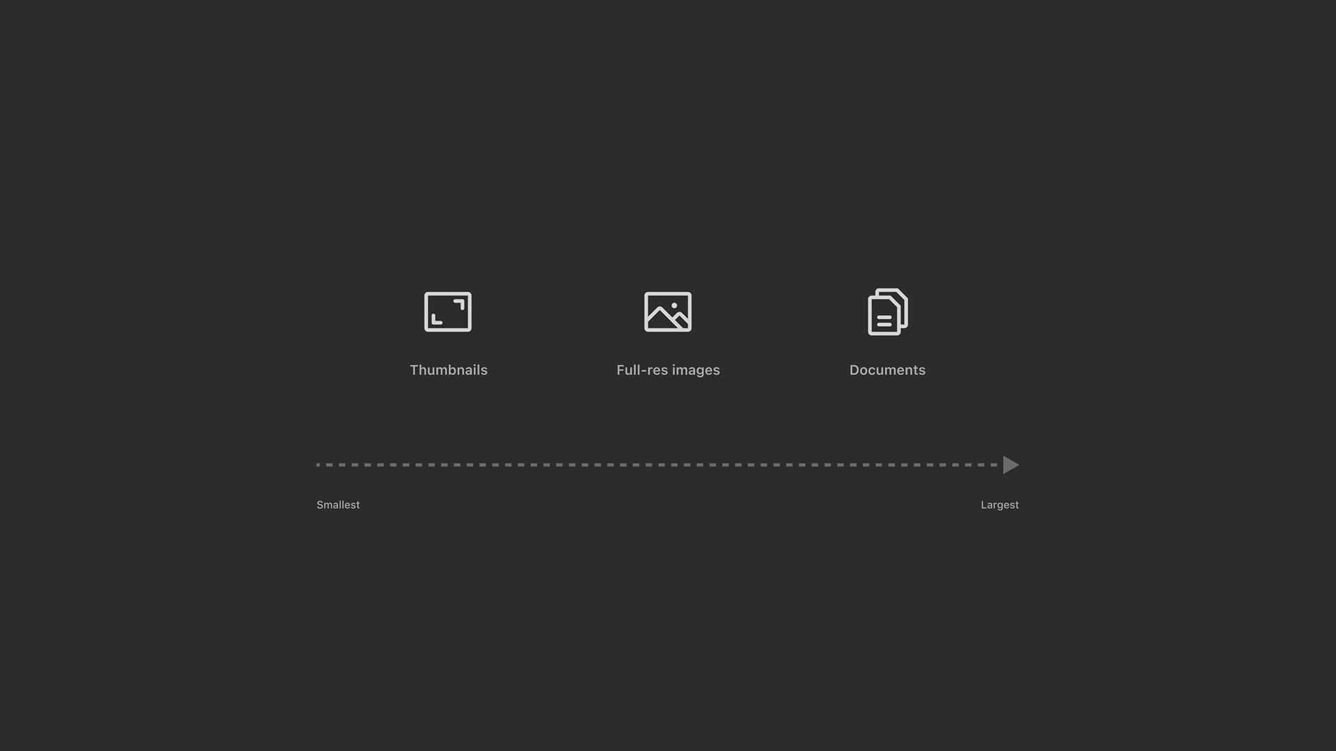
5. Introduced lazy loading and intelligent prioritisation
- Implemented lazy loading so thumbnails appeared as users scrolled, improving perceived speed.
- Collaborated with engineers to rework the sync queue logic:
- Prioritised recently updated Private Views.
- Promoted assets for actively viewed content.
- Ordered downloads by user-centric value: thumbnails → full-size images → large documents.
- This approach ensured users saw meaningful content first, reducing perceived lag.
Results & impact
With no ability to overhaul backend performance, we focused exclusively on the frontend—using UI feedback and careful interaction design as our primary levers.
- Support tickets dropped: Reduction in sync-related tickets in the first weeks post-launch.
- Increased trust: Users reported feeling more confident using the app during important sales moments.
- Internal alignment: Product and engineering teams saw how thoughtful design could solve technical perception issues.
"I actually trust it now. I don’t have to second-guess if my data is there." – Gallery sales associate
Reflection
This was the first fully design-led project on the mobile team, and it demonstrated the strategic value of structured, user-focused product design. Beyond UX outcomes, this work:
- Preserved product viability by addressing the #1 user trust blocker.
- Changed internal attitudes towards design-led discovery and problem solving.
- Clarified the app’s purpose across departments—securing future investment.
Beyond the UX wins, this project helped:
- Save the app from potential deprecation.
- Shift internal perception of the design team’s value.
- Reinforce that performance perception is often just as important as performance itself. This project reinforced that UX can improve system trust, even when core tech limitations remain. Key lessons:
- Transparency beats perfection: Visibility creates confidence.
- Design as facilitation: A well-structured workshop surfaced constraints and solutions early.
- Small changes, big effects: Just a few well-placed indicators shifted the entire experience.
In the future, the next step would be to improve sync performance itself—but this redesign ensured the app could still be relied on in high-stakes, low-connectivity moments.