Web designer and developer
I led the early design and technical foundations of a scalable design system for a new SaaS platform at Artlogic.
Building a flexible component library to kickstart a design system
Building a flexible component library to kickstart a design system
Summary
I led the early design and technical foundations of a scalable design system for a SaaS platform modernisation project at Artlogic. Acting as both a designer and a developer during the prototyping phase, I audited and selected component libraries, created a Figma UI kit, and collaborated closely with stakeholders and engineers to align on customisability, accessibility, and long-term scalability. The component library I built was adopted as the foundation for the platform’s future design system, with components used in production.
This work was part of a broader platform rebuild aimed at modernising both the user experience and the visual identity of Artlogic’s core product. Artlogic is a scale-up with low design maturity, and this platform had grown organically over two decades with no design system and limited UI strategy. The last design refresh had happened over ten years ago, largely as a stylistic CSS layer rather than a thoughtful overhaul.
Role and timeline
- Role: Product designer & front-end prototyper
- Team: Lead product designer (UI focused), director of user experience, director of marketing, engineering managers, later joined by full-stack engineers
- Timeline: Initial audit and prototype phase (2 months), Figma library development and cross-functional collaboration (3+ months)
- Platform: React (Radix UI, later Mantine), Figma
The challenge
As Artlogic looked to reinforce its position as a market leader amid growing competition, the company initiated a complete product rebuild. With no engineers yet assigned, early prototyping needed to begin. The challenge was twofold:
Create a working proof-of-concept to demonstrate the product concept and support a funding proposal.
Lay the groundwork for a scalable design system that could support long-term development.
From the outset, stakeholders stressed the need for full control over presentational styles, visual refinement that reflected the art world, and adherence to accessibility best practices. There was also a desire to future-proof the work by choosing the right component architecture from the start.
Aligning with brand and defining design direction
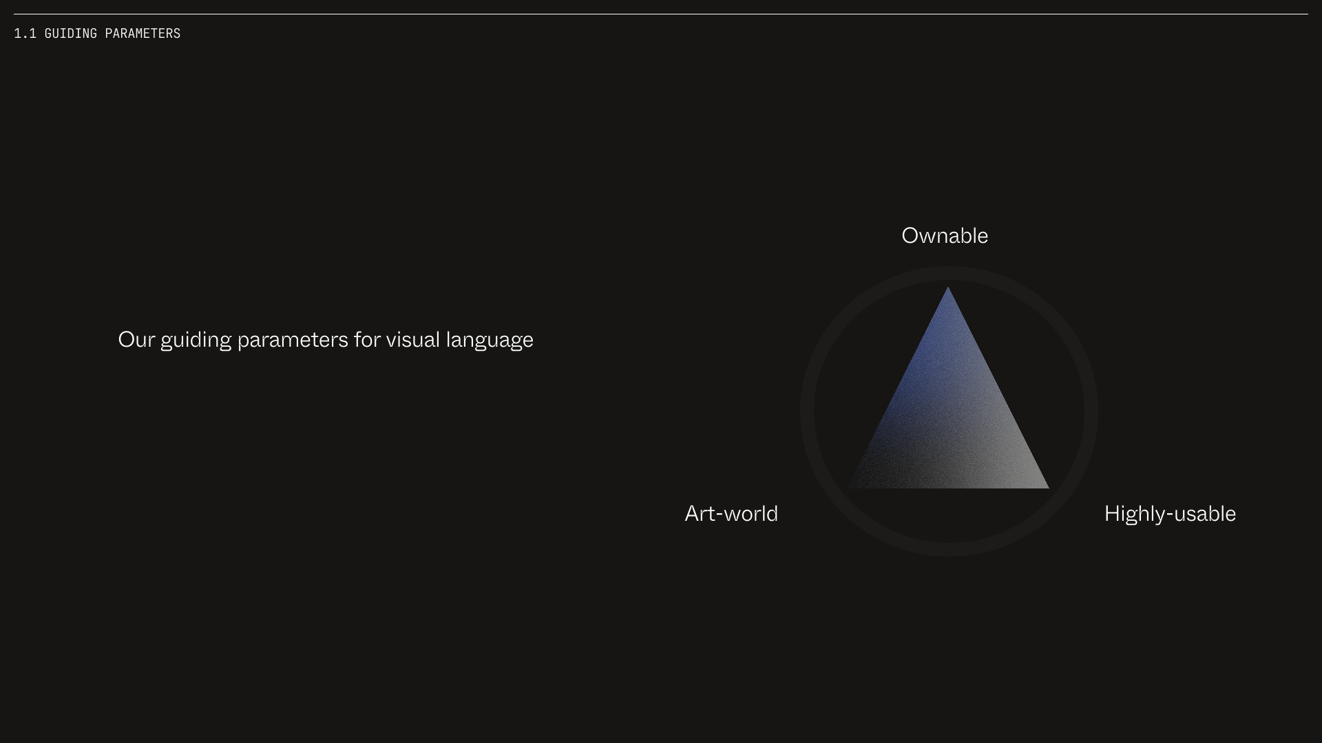
The redesign effort was timed alongside a broader brand refresh led by the marketing team. To ensure visual alignment and cross-functional buy-in, I collaborated with marketing throughout the project. We tested ideas like introducing ABC Whyte Inktrap for headings and greyscales based on brand tones. Ultimately, we opted for a more neutral, less stylised approach to match the aesthetic expectations of high-end galleries. However we still incorporated small elements from the brand such as an accent colour, and the subtle usage of a monospaced font.
Together with the design team, we formalised a set of guiding design parameters:
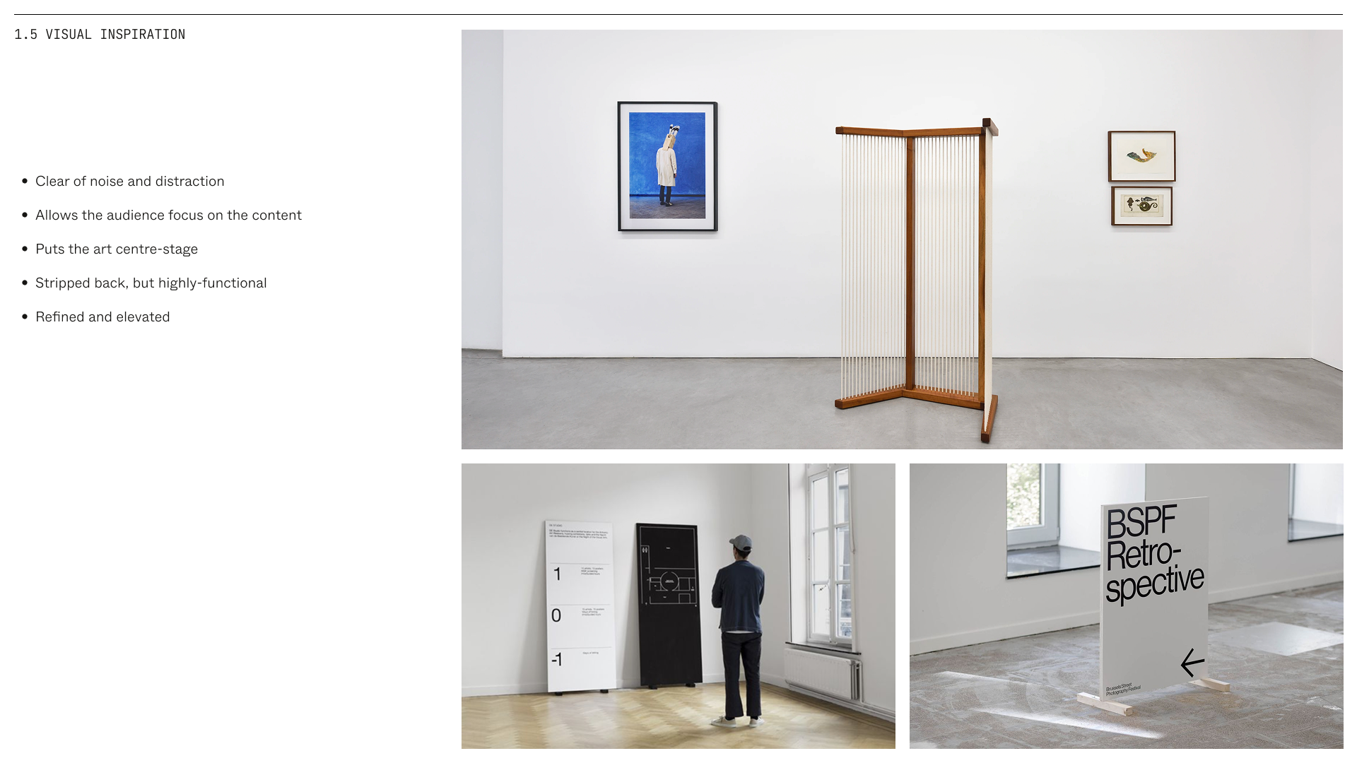
- Discernibly art-world – Clean, minimalist, and structured. Inspired by gallery signage and interiors.
- Ownable, not overbearing – Subtle brand touches without imposing too much of our identity.
- Highly-usable – Familiar, typographic, and accessible. Clear hierarchy and restrained colour use.
These helped us align internally and provided a reference point for cross-team presentations. We then codified eight modernisation principles to guide UX and platform decisions - ranging from “Familiarity First” to “Simplicity First, Configurability Later.”
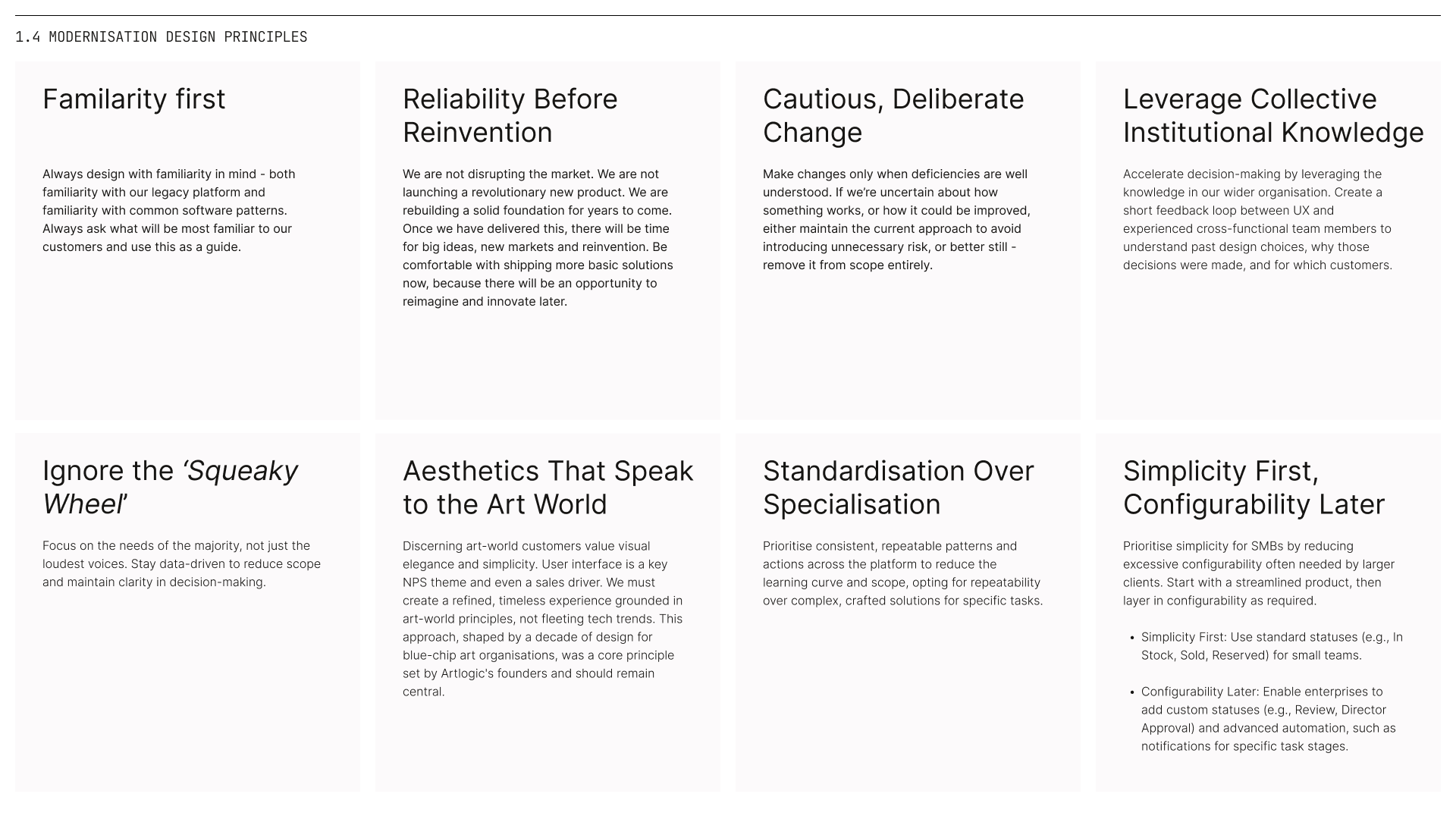
These principles were collaborative and iterative. I contributed to their creation and helped present them to different internal teams. Rather than one-size-fits-all demos, we ran tailored sessions, including:
- C-suite – Strategic alignment and competitive positioning
- Marketing – Visual system and brand cohesion
- Engineering – Component architecture and implementation model
- Customer support – Expected impact on users and messaging
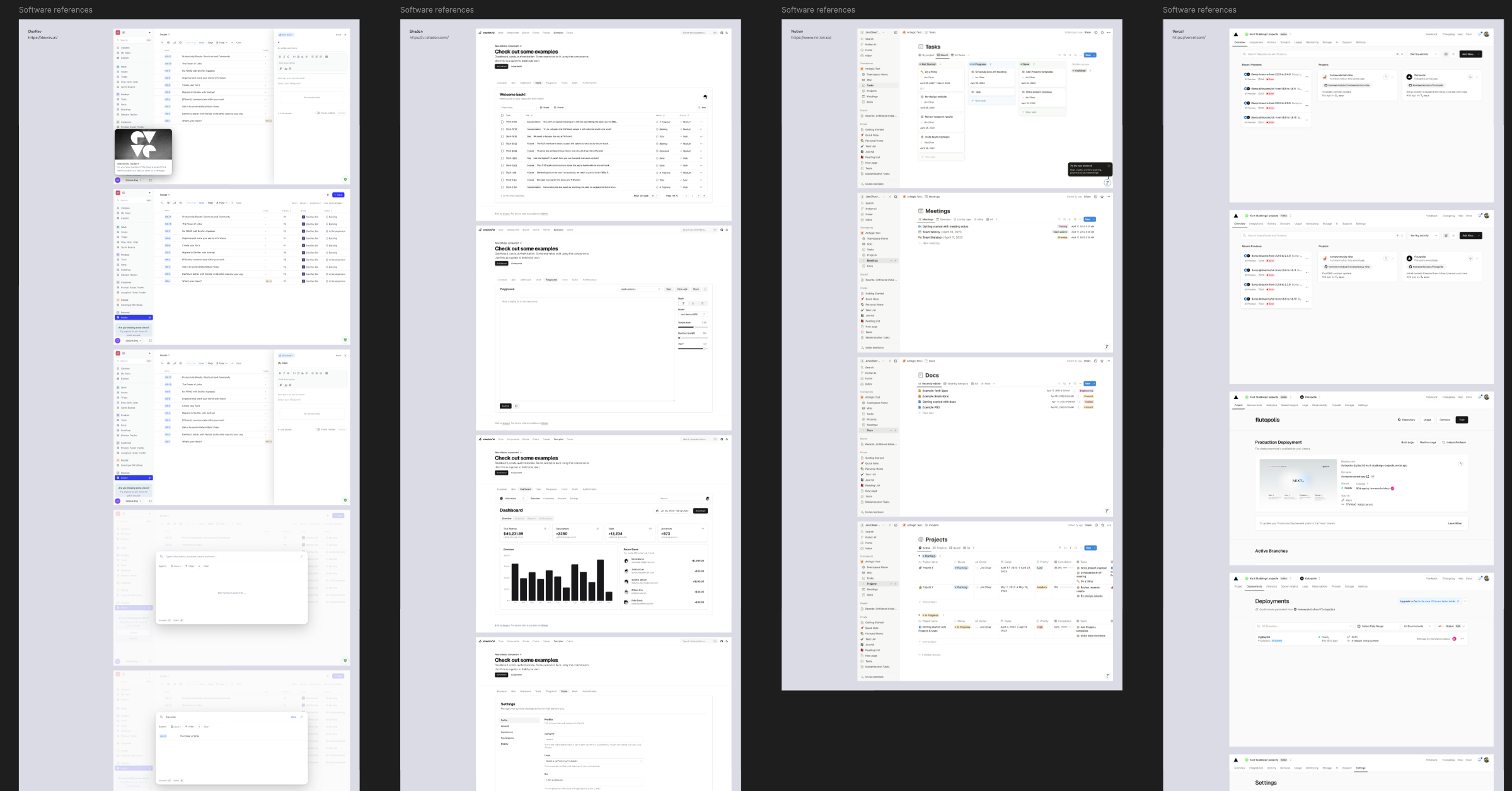
Auditing component libraries
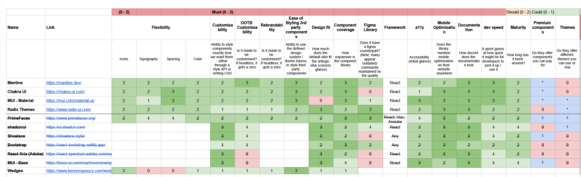
With no engineering resources yet available, I led the evaluation of component libraries myself. I conducted a structured audit of several popular libraries, assessing each one based on:
- Component coverage and completeness
- Customisability and design flexibility
- Accessibility compliance
- Figma compatibility
- Extendability and documentation quality
The audit was presented to stakeholders using a weighted score model. The conclusion:
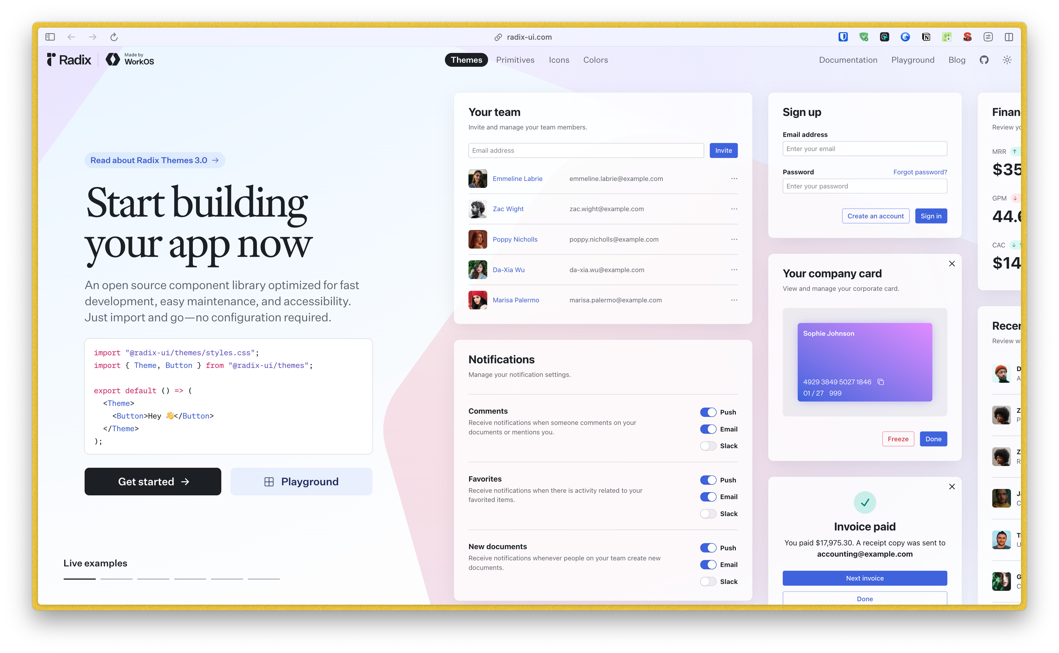
Radix Primitives offered the best long-term solution for building a fully custom design system with full presentational control and baked-in accessibility.
For the prototype phase, we adopted Radix Themes, a styled layer built on Radix Primitives. This enabled faster development while preserving architectural flexibility.
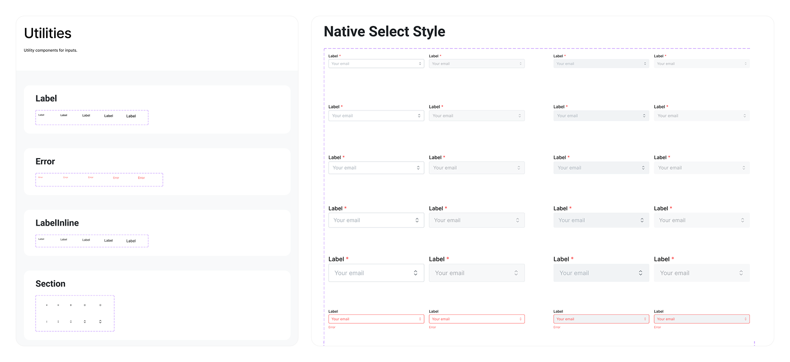
Creating the Figma UI kit
After the prototype gained stakeholder approval, I began building a robust, reusable Figma component library based on the Radix structure. This included:
- Designing base components (buttons, inputs, overlays) with variant controls and responsive layout
- Using Figma variables and nested instances to maximise flexibility
- Establishing clear naming conventions and organisational structure
- Sharing internal demos and lightweight docs to drive adoption
This initial library became the team’s default UI toolkit.
Navigating friction and adapting to new engineering constraints
After the prototype phase and initial sign-off, new engineering leads were introduced to the project. Although the original plan to use Radix Primitives had been agreed upon by engineering managers and the UX team and documented in a decision log, the new leads strongly disagreed with the approach. Having not been part of the earlier process, and seeing the decision as driven by design rather than engineering, they pushed back.
I took the initiative to rebuild trust and transparency. I created a dedicated presentation to walk them through the full rationale behind our component audit, including accessibility benefits, flexibility, and alignment with our brand and design goals. I presented our decision-making framework and showed how we had aligned previously with engineering leadership.
After discussion, we reached a compromise. While the new leads acknowledged the value in the primitives approach, they proposed sticking with Radix Themes for its styled components, given that the incoming full-stack engineers were less confident writing raw CSS. Although this shift was frustrating from a design system purity standpoint, I agreed that we needed to optimise for team fit rather than ideal architecture.
This moment reinforced the importance of documentation, diplomacy, and adapting to new constraints without losing sight of long-term goals. It also set the stage for further compromise as we evaluated new component libraries together. We revisited the library audit with engineering input, comparing:
- React Aria – Headless, accessible, but required custom styling
- MUI – Fully styled, rigid, hard to theme (engineering's favourite)
- Mantine – Fully styled, themable, large component set
We ran short prototyping spikes and agreed on Mantine as the best compromise. However, Mantine had no official Figma kit - and third-party ones were poor quality.
Delivering the Mantine-aligned component library
To resolve this, I rebuilt the Figma library from scratch to match Mantine’s structure and styling:
- Reverse-engineered component logic and tokens from Mantine docs and code
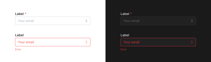
- Created accurate Figma versions of Button, Input, Popover, DatePicker, and more
- Ensured naming conventions and component states matched development output
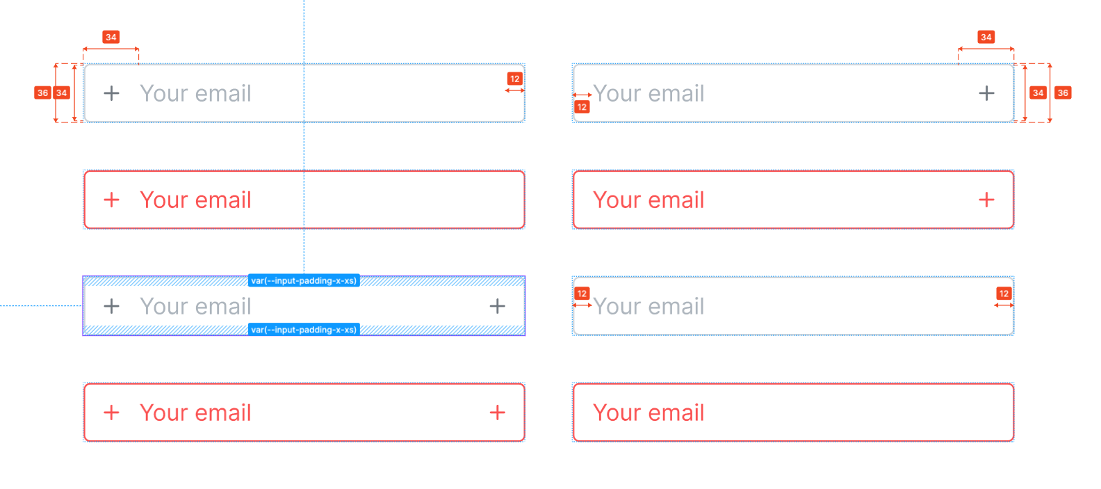
Example: recreating the input component with layout constraints
While recreating components from the Mantine UI library, I found it was often faster to refer directly to the codebase than rely on documentation or browser inspection. All global tokens were defined in a central global.css, with component-specific tokens living in modular CSS files (e.g. input.module.css). This made it straightforward to reverse-engineer sizing, spacing, and behaviour - especially for more complex elements like form inputs.
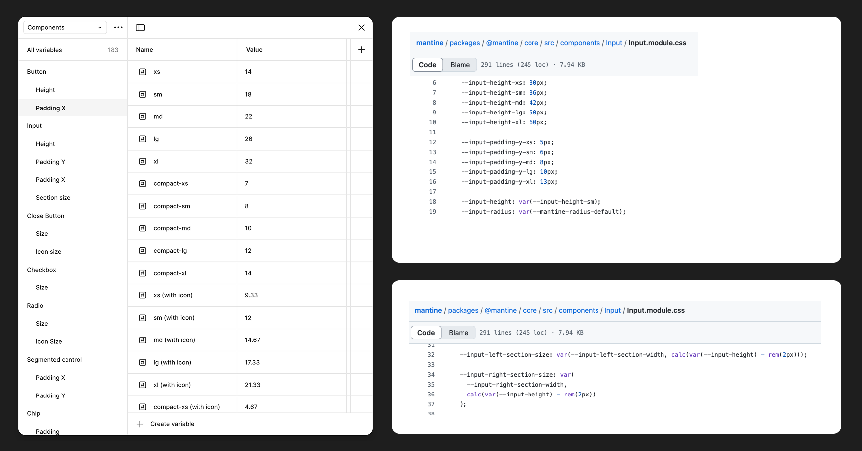
Inputs were particularly interesting because their layout in code didn’t align with typical Figma patterns. In most systems, leading/trailing icons are handled with boolean properties and auto layout, toggling visibility without breaking spacing. But Mantine used fixed icon slots based on the input height minus 2px (to account for border width) - a detail I uncovered by reading the component-level CSS custom properties.
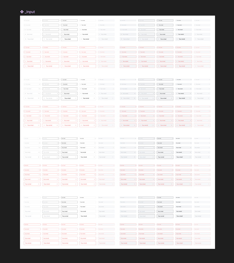
To replicate this in Figma:
- I created icon slot subcomponents for each size, ensuring the icon slots matched Mantine’s rules exactly.
- I built input variants for no icon, left icon, right icon, and both.
- I explored a clever workaround using a 0px shim and auto layout quirks to reduce variants, but opted against it. The team agreed that clarity and maintainability were more important than magic.
To reduce duplication, I also created a base input wrapper used across related components like textareas, selects, and comboboxes - all of which shared the same visual rules and token structure.
Outcome
- Design system foundations aligned with both brand and technical constraints
- Component library adopted by design and engineering teams, and even product managers to knock up ideas while design resource was scarce.
- Increased design confidence and clarity during handoff
- System principles adopted as part of broader team alignment
Reflection
This project taught me how crucial it is to meet teams where they are, not where you wish they were. While I still believe Radix Primitives was the ideal long-term solution, I saw firsthand how choosing the 'technically pure' approach can create drag when team buy-in and skill coverage aren’t in place. If I were to do this again, I’d align earlier with future engineering leads or pre-empt those needs with a dual-path plan (ideal vs pragmatic).
I also gained new clarity on what not to document. Avoiding overly rigid specifications too early in the system’s life. A shared vision and guiding principles did more for alignment than pixel-perfect specs.
Most of all, I learned how to keep design moving forward in complex environments. Stakeholder management, compromise, and over-communication were just as vital as visual quality or component fidelity.
Other key learnings include:
- Not all colour contrast is created equal: After creating the Radix UI proof of concept, we realised that the Radix colour system uses APCA for colour contrast rather than WCAG. While it's arguably a better colour contrast algorithm (particularly when it comes to reds, oranges, yellows), meeting WCAG 2.2 AA accessibility standards requires WCAG contrast to be met. This meant we would need to rework some of the colours from the Radix colour system and couldn't fully trust them out-of-the-box.
- Even Mantine, when used out-of-the-box without any customisation, didn't always meet accessibility standards for colour contrast. It fell on the design team to assess each component thoroughly before using it and then checking with engineering about ensuring the required customisations could be factored in.