Note, some details have been withheld due to comply with company confidentiality agreements. This is to ensure the protection of sensitive information and intellectual property. I appreciate your understanding.
Artlogic App users were facing significant difficulties when it came to syncing Private Views to their devices. Working around technological and time constraints, I helped improve the perceived syncing experience through considered UI and UX design, ultimately leading to a reduction in support tickets.
For the purpose of this case study, I'll focus on a couple of the key solutions I designed.
What is the Artlogic App?
The Artlogic App is a companion to the Artlogic Database - A SaaS platform with all the tools needed for an art gallery to run their business. The companion app is primarily a presentation and sales tool. It is a way for gallery staff to display collections of artworks (Private Views) and their associated details when talking to prospective art collectors. If collectors are interested in artworks, users are able register this interest in the form of offer emails. These offers are then recorded within the Artlogic database platform.
The app is designed to be offline-first which means it will sync all selected Private Views and artworks to the user's device, allowing them to be accessed at all times. This was an early architectural decision as the app was initially conceived as a 'digital art binder' with the intention of replacing a physical binder of printed information sheets often used at art fairs where internet connection was often patchy or non-existent. Designing and working around this architecture presents a multitude of design challenges as we find the balance between customer expectations and tech limitations.
The team
The Mobile Team consists of:
- Product Manager
- 2 iOS Engineers
- Platform Engineer
- Product Designer (me)
Before joining the team, the Mobile Team previously operated without a designer and the majority design decisions were made by the engineers themselves. As I had spare capacity, I stepped in as a temporary Product Designer to assist the team and to shift towards a design-led way of working. The goal was to put users and their needs first.
The problem
The vast majority of support tickets received by the mobile team were regarding syncing issues or perceived syncing issues. For larger clients, the app is required to sync a lot of data and images for offline access. Due to instability and unreliability in the Artlogic Database and the syncing mechanism, it was difficult for us to differentiate between actual issues, user error, and inpatient clients.
The product manager and I conducted an analysis of the support tickets and determined that while there are some definite technological issues, perceived syncing issues were a significant factor.
Following the initial analysis, I spoke to affected customers to find out more about their experiences with the app to gain insight into the perceived issues and how users were affected. A couple of key themes emerged:
- Lack of confidence around the status of syncing - "The app keeps freezing!", "Is this up to date?"
- Poor syncing speeds - "I wan't to access my Private Views faster!"
These were where we focused the team's attention.
To kick things off, I held a workshop with the engineers to gain a deeper understanding of the syncing mechanism itself and its dependencies. The purpose was to find out how and why issues were manifesting, and to work out some potential paths forward. It surfaced that a lot of the problems were rooted in the Artlogic Database which, due to other commitments by that team, were off-limits to fix. This left us with focusing our attention on the app UI itself and potentially being able to make some small improvements to the sync API. In this workshop, we asked: What information do we currently have available? What information could we easily gain access to? And what is off-limits?
We combined this with some hypothesises regarding what information users might find useful in the context of syncing, how we might be able to communicate this to users, and where they might expect to find this information. We also has a look at other apps for inspiration for how we could deal with the problems faced.
Lack of confidence
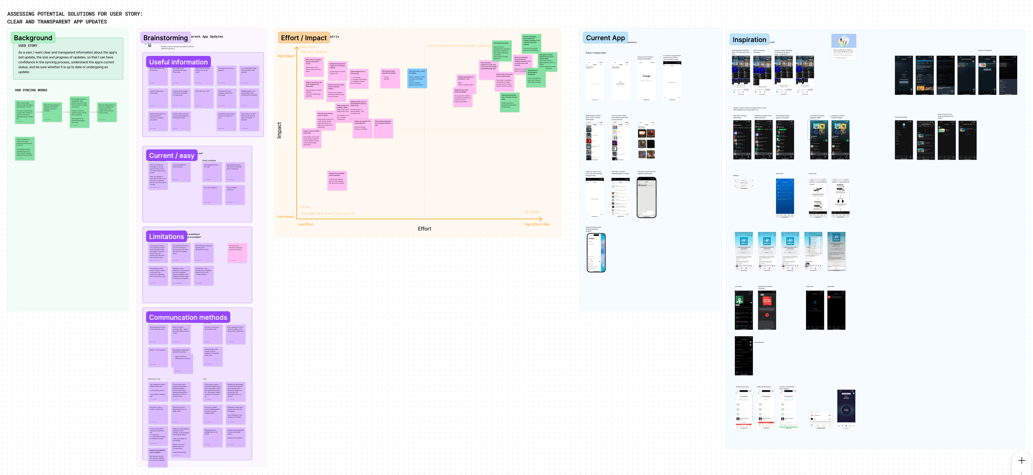
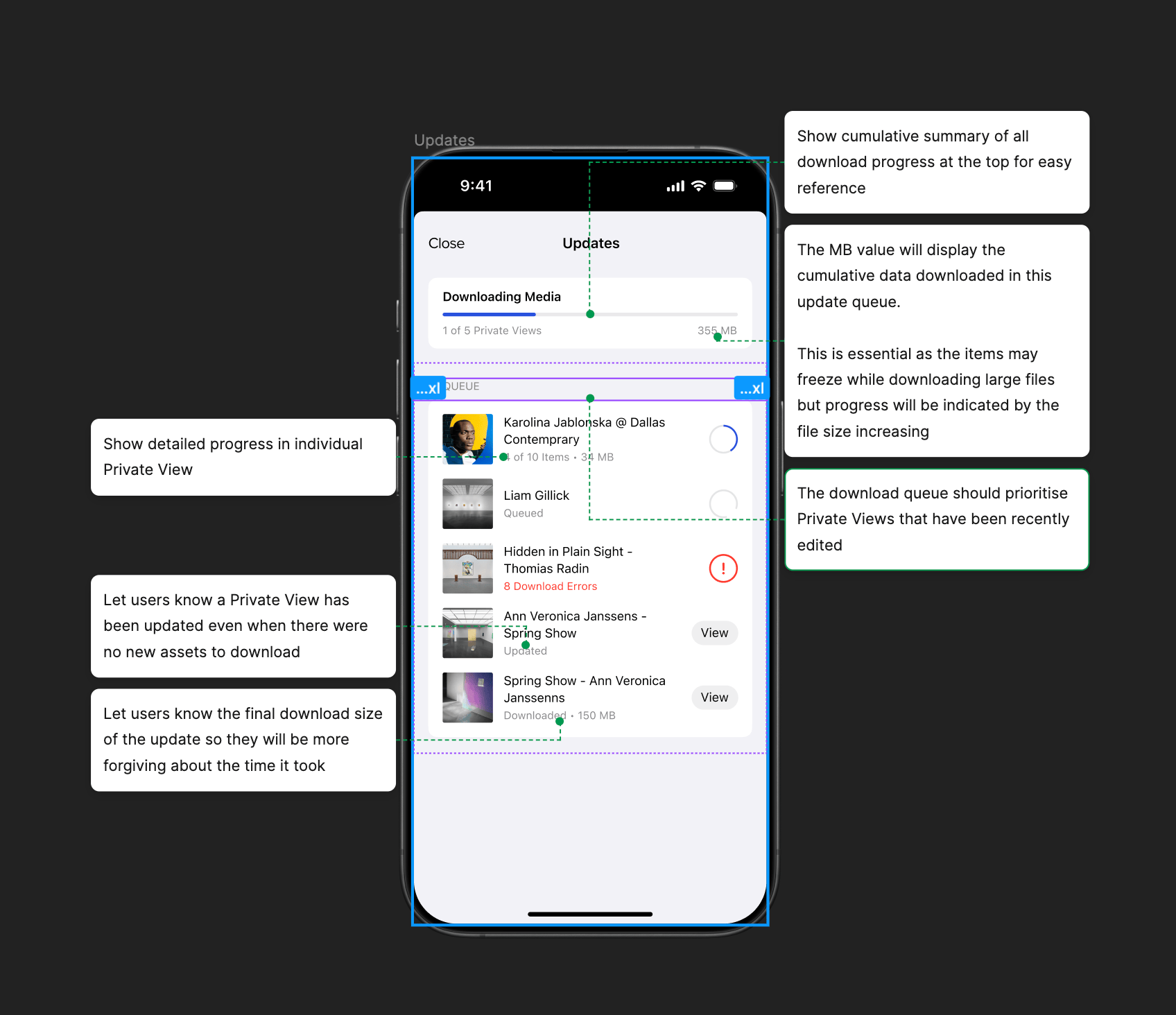
During the update process there is very little clarity around the overall progress. Users see a combination of completely static text (“has the app frozen?”) or the ‘chaos' download sheet - containing potentially hundreds of loading bars in no logical order. When a Private View completes downloading is instantly disappears from the screen and users lose context and visibility.
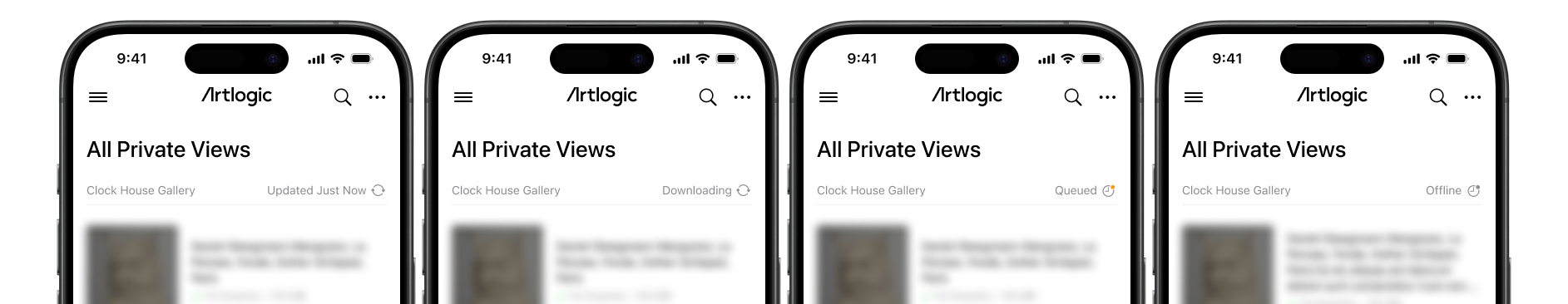
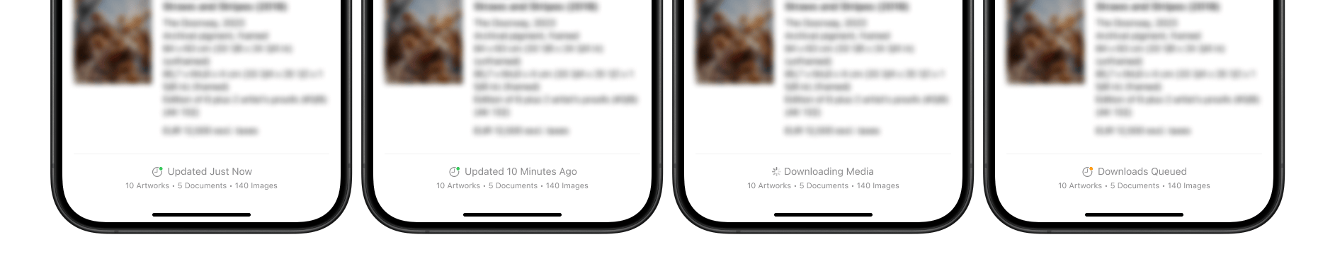
Progress bars were based on % of total files download so downloading large files can make the app look like it has frozen. Between updates, there is no clear way to know when the last sync took place, when the next will occur, how large the files are, and how these impact your storage space.
As a result, users believe the app is freezing, when in reality it is often just taking a long time to complete a download of vast amounts of data and potentially huge documents. Clients are also potentially unaware that the huge documents they are uploading may be impacting download times - leading to poor syncing speeds.
Below are some of the improvements made:
Displaying summary of sync progress
We added a section to the top of the updates sheet to provide a summary of the entire sync process and to give users a better indication of overall progress. This, combined with showing currently downloading Private Views at the top of the list as well as persisting completed Private Views in the list was a massive improvement to the experience in this screen.
Displaying file size downloaded to show constant progress
In an ideal world, we would've based the progress bars on how much data there was to download in a sync rather than the number of files. Using the number of files is misleading to users as some files may be a few kilobytes while others range into hundreds of megabytes. Due to technical limitations, we are not able to determine how much data will be in a sync so we had to continue using the number of files to display progress.
One key part of the new designs was to display the cumulative downloaded file size of each sync so that users will continually see some sort of progress / movement on screen. This means that when previously the app would appear frozen with motionless progress bars, users now see the number of megabytes downloaded continually increase as it downloads large files. From our testing we found that this had a significant effect on inpatient users who would often watch the download progress bars while waiting for their content.
Poor syncing speeds
While fixing the underlying speed issues was outside of scope, there was a lot we could do to improve perceived speed through some key UX changes I designed.
Faster access to view Private Views
This was a no brainer. Previously users were blocked from viewing their Private Views while the app was syncing / downloading assets. This meant that some clients could be blocked from using their app for multiple hours. By removing this block, we allow clients to access their data as soon as the API response has been parsed rather than waiting for all assets to complete downloading. We combined this with introducing Lazy Loading so even though all images are in the download queue, images will be fetched as the user tries to view them which gave the illusion of everything downloading faster.
Prioritise the Private Views and images users want to see
Previously, the app downloaded Private Views and assets in a completely random order. After speaking to clients, it was clear that the majority of users will edit a Private View and then try to look at it on the app soon after. By changing this order to first prioritise downloading recently edited we let users view the Private Views they care about most sooner. We also added a mechanism that would prioritise the assets within a Private View when a user views it so that the perceived download speed is improved.
We also took this a level further and introduced a priority to specific file types that were being downloaded so that the app would prioritise image thumbnails (the fasted to download and most visible), full-resolution images, then documents (often the slowest to download due to large file size).
Results
At the time of writing, we have recently started rolling out changes to clients and have seen promising signs.
The Mobile Team also experienced an increase in velocity as my work as Product Designer meant that solutions were more detailed, planned ahead of development and tested.
Due to the consistency and precision of the designs, I was asked to demonstrate my work to other Product Designers at Artlogic. Particular focus was put on the additional notes to explain to developers all interactions and restraints as well as detailed annotations.